USA
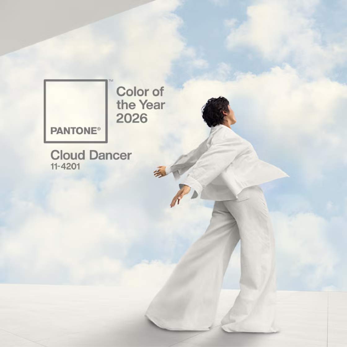
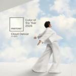
Whenever Pantone announces its annual Color of the Year, the global design community pays close attention, since such a choice is rarely regarded as a mere aesthetic preference but rather as a symbolic reflection of prevailing cultural moods and societal aspirations. In 2026, Pantone selected Cloud Dancer, a soft white intended to embody serenity, renewal, and the promise of clarity in uncertain times. Nevertheless, although the company emphasized its calming and restorative qualities, the decision quickly provoked controversy, as many commentators questioned both its originality and its broader cultural implications. This essay will therefore examine the supportive perspectives that highlight its potential as a blank canvas for creativity, alongside the critical voices that dismiss it as uninspired or exclusionary, before ultimately arriving at a conclusion that considers the deeper significance of color as a medium of dialogue rather than mere decoration.
Firstly, advocates contend that Cloud Dancer embodies not only clarity and openness but also a symbolic invitation to pause and reflect in an increasingly complex cultural landscape. Because white functions as a “blank slate,” it provides designers with an unobstructed canvas upon which creativity can be projected without distraction, thereby encouraging innovation unburdened by preconceived associations. Moreover, the rise of minimalism as a dominant aesthetic in contemporary interior design underscores the relevance of this choice, since white naturally complements streamlined forms, clean lines, and spatial harmony. In addition, several commentators argue that after a succession of bold and saturated tones dominating previous years, a deliberate return to simplicity signals society’s collective yearning for equilibrium, introspection, and renewal. Thus, from this perspective, Pantone’s selection of Cloud Dancer is not merely an aesthetic decision but a persuasive cultural gesture, one that resonates with broader desires for balance, inclusivity, and the re-centering of design around calmness and possibility.
On the other hand, critics contend that Pantone’s selection of Cloud Dancer is ultimately uninspired, failing to capture the imaginative potential expected of a global design authority. Since white is frequently perceived as “not a color” but rather as an absence of hue, many designers dismissed the choice as lacking originality and creative daring, particularly when compared to the vibrant tones that have defined previous years. Furthermore, questions of cultural sensitivity have been raised, as elevating white to the status of the defining color of 2026 risks reinforcing symbolic associations with exclusion and privilege, a problematic gesture in a period marked by heightened awareness of diversity and inclusion. In addition, opponents argue that Pantone overlooked an opportunity to champion a more transformative shade—one capable of inspiring optimism, creativity, and social progress—thereby weakening the symbolic impact of its annual announcement. From this perspective, Cloud Dancer is not merely a neutral or minimalist choice but a missed chance to engage meaningfully with the cultural and emotional dimensions of color in a way that could have resonated more powerfully with contemporary audiences.
In contrast to Pantone’s restrained selection of Cloud Dancer, other organizations embraced more vibrant and symbolically charged tones for 2026. Benjamin Moore announced Silhouette (AF-655), a luxurious burnt umber interwoven with subtle charcoal undertones, praised for its warmth, sophistication, and ability to balance tradition with modern elegance.
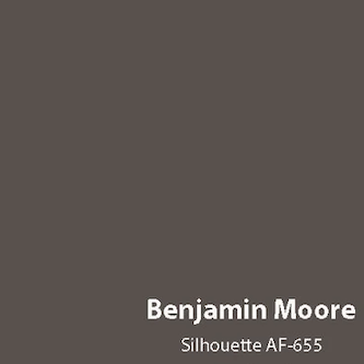
Benjamin Moore announced Silhouette (AF-655).
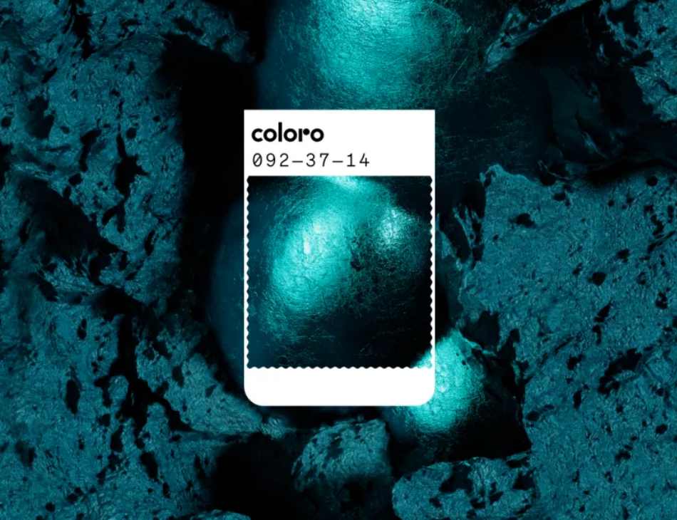
This choice reflects a renewed interest in earthy, nature-inspired hues that convey comfort and timelessness. Meanwhile, global trend forecaster WGSN, in collaboration with Coloro, highlighted Transformative Teal, a bold fusion of dependable dark blue and aquatic green, framed as progressive and hopeful. Positioned as a color of ecological awareness and societal redirection, Transformative Teal symbolizes resilience, regeneration, and a collective demand for change.
Consequently, when placed alongside these alternatives, Pantone’s Cloud Dancer appears notably more restrained, embodying minimalism and serenity rather than transformation or warmth. This comparative context underscores the divergent philosophies guiding color forecasting: Pantone’s emphasis on calm reflection versus Benjamin Moore’s embrace of earthy richness and WGSN’s projection of future-oriented optimism.
In conclusion, Pantone’s designation of Cloud Dancer as the Color of the Year 2026 ultimately fails to meet the cultural, aesthetic, and symbolic expectations that accompany such a globally influential announcement. While advocates emphasize its serenity and minimalist appeal, these arguments are outweighed by the more compelling critiques that highlight its lack of originality, its tenuous status as a “non-color,” and its problematic symbolic associations in a period marked by heightened sensitivity to diversity and inclusion. By elevating white to the defining shade of the year, Pantone risks reinforcing exclusionary connotations rather than advancing a vision of creativity and progress.
Moreover, when situated within the comparative landscape of other organizations’ selections, Pantone’s choice appears particularly restrained and unimaginative. Benjamin Moore’s Silhouette, a rich burnt umber praised for its warmth and timeless sophistication, and WGSN’s Transformative Teal, a bold fusion of aquatic green and deep blue framed as progressive and hopeful, both demonstrate how color forecasting can serve as a vehicle for cultural resonance and aspirational change. Against these vibrant alternatives, Cloud Dancer seems less a gesture of renewal than a retreat into neutrality, signaling a missed opportunity to inspire optimism, innovation, and collective transformation.
Ultimately, Pantone’s decision underscores a disconnect between its symbolic narrative and the dynamic cultural currents shaping design today. Rather than functioning as a catalyst for dialogue and inclusivity, Cloud Dancer risks being remembered as an uninspired choice that failed to capture the imagination of designers and consumers alike. In this sense, the controversy surrounding its selection is not merely a conversation starter but a reminder of the responsibility borne by global trendsetters: to harness the communicative power of color in ways that reflect, challenge, and elevate the cultural moment.
Questions to Challenge Your Perspective
The debate around Pantone’s 2026 Color of the Year, Cloud Dancer, is far from settled—and that is precisely what makes it so fascinating. We have explored both the supportive and critical perspectives, but the conversation gains real value when diverse voices join in.
- How does the controversy illustrate the symbolic power of color in shaping cultural dialogue?
- Can serenity and renewal be universally understood, or are these values culturally specific?
- Does elevating white risk reinforcing exclusionary narratives, and if so, should Pantone have anticipated this ethical dimension?
- How do you compare Pantone’s choice with Benjamin Moore’s Silhouette or WGSN’s Transformative Teal?
Share your thoughts in the comments below. Your perspective can enrich this discussion and help us understand how design choices resonate across different communities. After all, color is not just decoration—it is dialogue, and your voice is part of that conversation.


Leave a Reply